Skip to content
REDDIGITAL

CASE STUDY · TOUCH OF NATURE

Conversion was twice the norm. The problem was elsewhere.

A Latvian Bach flower brand with 11 years of practice behind every bottle. We rebuilt the product page, the offer and email capture, and we report the result as it is, including the part that didn't work straight away.

Client
Touch of Nature · touchofnature.lv
Category
Bach flower remedies for children and parents
Work
Audit, product page, offer, email
Period
September–October 2026
All work
  • 6.98%store conversion before we started (typically 2–4%)
  • 65%of orders were a single item
  • 0places to leave an email

STARTING POINT

Where we started

Touch of Nature sells Bach flower remedies for children and parents. Behind the brand is Ginta Slišāne, with 11 years of practice and more than 10,000 consultations. Most visitors come from Meta ads and land straight on a product page.

The audit's goal: grow revenue without raising ad spend.

August 2026 · Shopify analytics · RedDigital audit, 16 Sep 2026
Conversion rate6.98%industry 2–4%
Session → cart12.97%industry 6–10%
Cart → checkout70.5%industry 40–60%
Checkout → purchase76.3%industry 45–65%
Single-item orders65%
Email capturenoneno field, no Klaviyo
Analytics1 pixelno GA4, no Clarity

THE KEY FINDING

A standard CRO job would have been the wrong fix.

The store already converted at twice the industry average, at every step of the funnel. Pushing conversion higher would have been the most expensive route to the smallest gain. The real limits were two: order value and repeat purchases. The bundle was sold as a discount rather than a solution, so most buyers took one bottle. For a product that runs out and suits the next stage of a child's life, there was no way at all to reach the buyer again.

WHAT THE AUDIT FOUND

Five findings

  1. 01

    The bundle as a discount

    The offer block talked about euros saved, not about the outcome. 65% of orders were a single item.

  2. 02

    No email field anywhere

    Not in the footer, not on the product page, no Klaviyo. Abandoned checkouts got no reminder at all.

  3. 03

    The cookie modal covered the product

    A full-screen modal was the first thing a visitor from an ad saw. On the heatmap it covered the product image and the offer.

  4. 04

    Ginta's story went unused

    11 years of practice and 10,000+ consultations, yet a cold visitor saw a price with no context.

  5. 05

    Nothing to measure with

    A single Shopify pixel. Without GA4 and Clarity there was no honest way to compare before with after, so we installed both before launch.

WHAT WE CHANGED AND WHY

From finding to decision

01

The first screen

What we saw

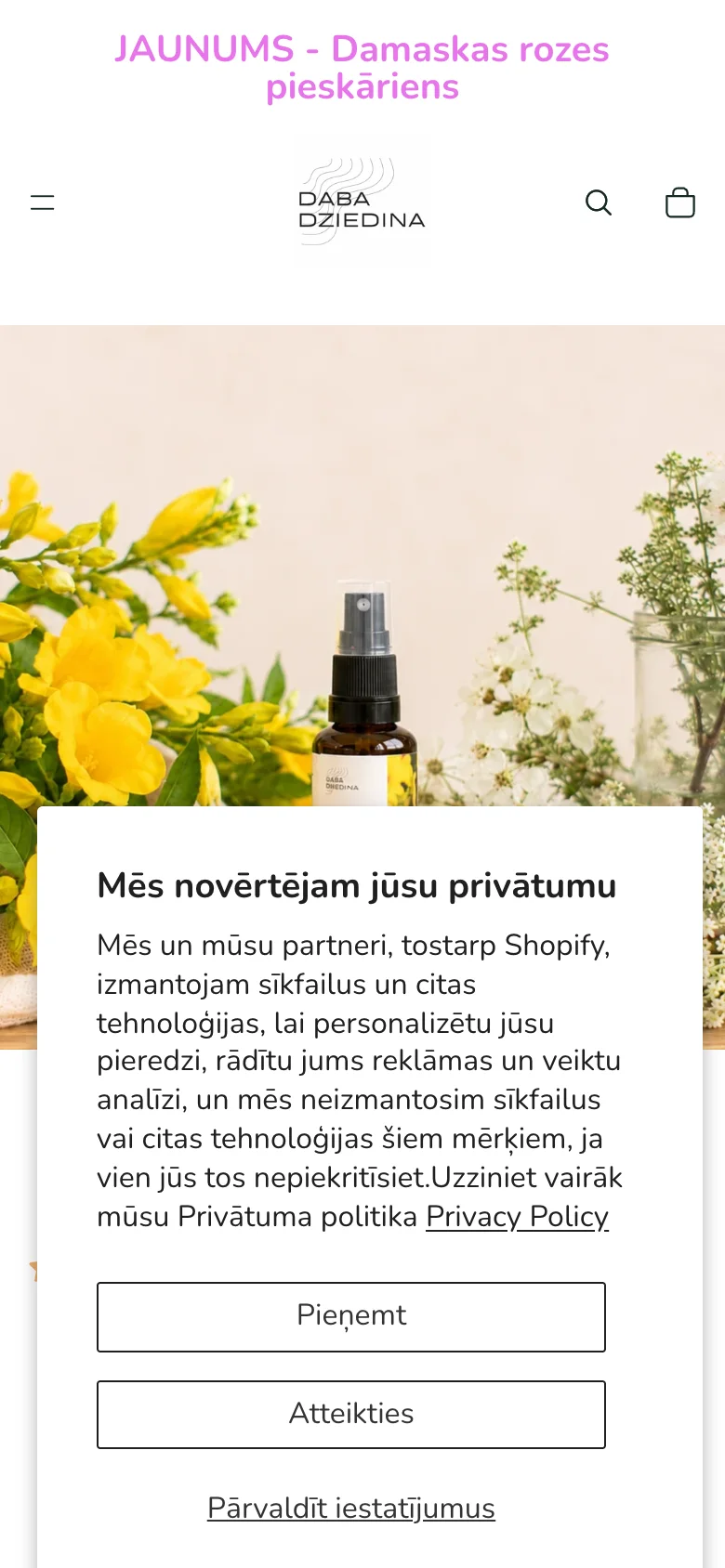
A visitor from an ad first saw a full-screen cookie modal covering the product, with two identical buttons.

What we changed

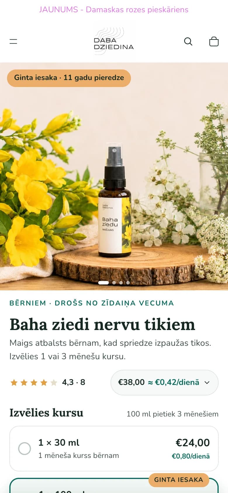
A compact, on-brand bar at the bottom with a clear Accept. The first screen now carries Ginta's recommendation, who the product is for, and the price per day.
Before · 30 Sep
Old product page on mobile: a full-screen cookie modal covers the product image
After · 22 Oct
New product page on mobile: product image, Ginta's recommendation, name, rating and price per day
02

The offer: a course, not a discount

What we saw

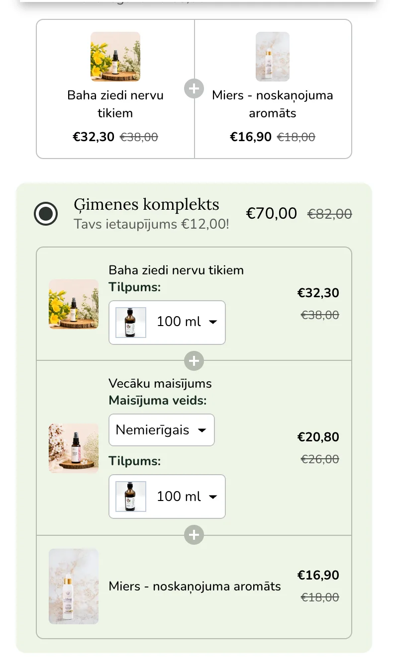
A three-product bundle with dropdowns. The value was expressed as euros saved.

What we changed

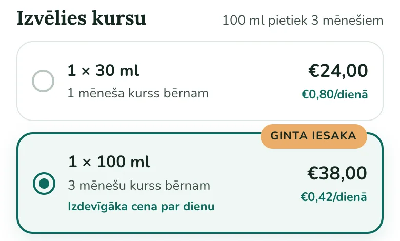
Two clear choices: a 1- or 3-month course. The larger bottle is preselected ("Ginta recommends"), and both show the price per day: the 100 ml works out almost half the price per day.

Before
Old offer block: a family bundle of three products with dropdowns and a saving in euros
After
New course picker: 1 × 30 ml for a month or 1 × 100 ml for three months, marked as Ginta's recommendation, with price per day
03

An add-on that works again

What we saw

After launch, the aroma add-on fell from 27% to 6% of orders. The old bundle gave the aroma a discount; the new page showed a plain line with no reason to add it.

What we changed

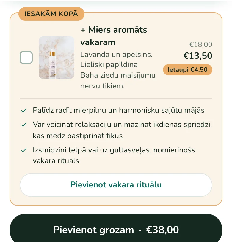
A "Recommended together" card with three benefits from Ginta's own explanation and a combo price. Still unticked by default, because EU consumer law doesn't allow pre-ticked paid extras.

First version · 8 Oct
First add-on version: a plain line with a checkbox and the aroma's price
After · 15 Oct
New "Recommended together" card: the aroma at a combo price, three benefits and an add button
04

Email from day one

What we saw

The product runs out after one to three months, but the store had no way to reach the buyer again.

What we changed

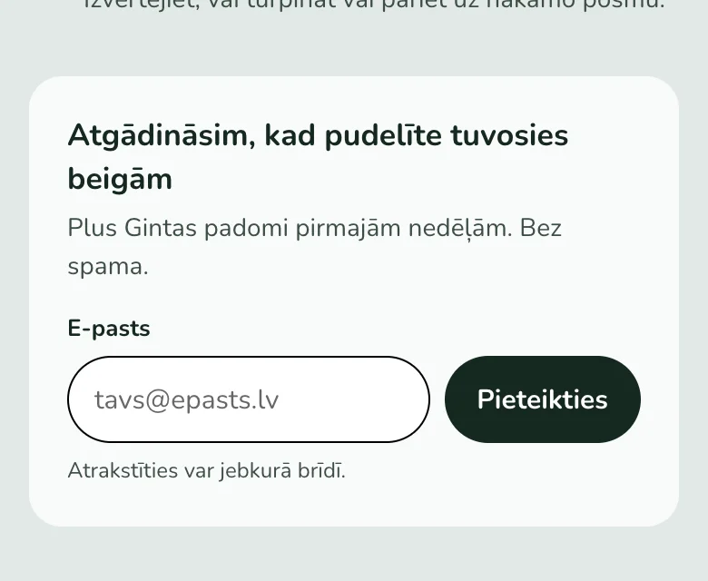
A refill-reminder sign-up on the product page, built on Shopify's own customer form, so emails collect even before Klaviyo. Next, an abandoned-checkout flow: three emails, no discount, only to people who gave consent.

After
Refill reminder sign-up: "We'll remind you when the bottle is running low" with an email field
05

A bug nobody was looking for

What we saw

On the "I already have my own blend" page, buyers picked their flowers, but the picks never reached the order. Both orders from the last 60 days had no flowers recorded.

What we changed

A new flower picker that writes the picks to the order, blocks ordering with none, and caps the choice at 10. We turned off express checkout on that page, because it skips the cart and would lose the picks.

RESULTS

The first 10 days

The tics remedy product page, launched 8 Oct 2026. Before: 10 Sep–7 Oct. After: 8–18 Oct. Shopify analytics, same definitions in both periods.

MetricBeforeAfter
Landing-page conversion5.4%5.6%
Revenue per session–−7%
Sessions per day–~2.7×
Leave from the first screen66%74%
Choose 100 ml75%67%
Add the aroma27%6% → 20%
  • A sequential comparison, not an A/B test. Ad spend roughly tripled over this period, so the page got more, and colder, visitors.
  • The aroma add-on recovered to 20% after the "Recommended together" card and combo price (15–18 Oct). That is 30 orders: a direction, not a conclusion.
  • The focus remedy page shows the same picture over its first three days: conversion slightly up, revenue per session down.
  • We'll publish the full comparison at 30 and 90 days.

WHAT WE LEARNED

Carry over the mechanism, not just the layout

The old page looked messy, but its bundle discount was doing real work: it sold the aroma in one order in four. The new page converts just as well, but at first earned less per visitor. Next time, before replacing an old page, we count what each of its elements sells, and we launch the new one as an A/B test rather than one after the other.

Want the same for your store?

Start with a conversation. We'll tell you what delivers the biggest effect first.

30 min call