Skip to content
REDDIGITAL

CASE STUDY · AMRANTHÉ

The ads worked. The page didn't convince.

A premium skincare brand, a €110 cream, and ads people clicked more often than usual. Yet fewer than 2 in 100 visitors added it to their cart. We rebuilt the product page around how people decide about a new brand and an expensive product.

Client
Amranthé · amranthe.com
Category
Premium “skin longevity” skincare
Work
Product page audit and rebuild
Period
September–October 2026
All work
  • ~3%ad click-through, above the 1–2% norm
  • 1.68%of visitors added the cream to cart, target 5–7%
  • 0purchases in the first week

STARTING POINT

Where we started

Amranthé is a premium skincare brand positioned around “skin longevity”. Its new product, NAD+ Skin Renewal Cream, cost €110 for 30 ml, and Meta ads sent people straight to its product page.

The ads did their job: people clicked more often than usual. The problem started after the click.

Meta ads and Shopify, before the rebuild · RedDigital audit, 25 Sep 2026
Ad → click~3%norm 1–2%
Session → cart1.68%cold traffic 5–10%
Purchases in week one0
Cart → checkoutnot measurabletoo few carts
Price€11030 ml, no reviews

THE KEY FINDING

People wanted the cream. They couldn't justify the risk.

Buying a €110 cream from a brand you've never heard of is a risky decision. In that moment people read the page not as an ad but as evidence: can I trust this brand? And the page gave the wrong answer. It carried copy about another product, a countdown stuck at zero, “coming soon”, and a pickup point for an event that was already over. None of that is a design question. Each one signals that nobody is looking after the page, and for a new brand that costs more than any font.

WHAT THE AUDIT FOUND

Five findings

  1. 01

    Copy about a different product

    The ingredients section described an oat-based cleanser with PHA acids, and the how-to-use block was about washing and rinsing. None of those ingredients are in the cream.

  2. 02

    Mixed signals

    A sale countdown showed 00:00:00:00, “coming soon” sat in the URL and the meta description, the pickup point was an event that had passed, and two different discounts ran at once.

  3. 03

    Nothing to lower the risk

    No reviews, no founder, nothing about who stands behind the brand. For cold traffic to a new brand, this is the most common reason a purchase stalls.

  4. 04

    The name promises NAD+, the formula doesn't explain it

    The cream contains no NAD+. It contains niacinamide, vitamin B3. The people who click an NAD+ ad are exactly the ones who check ingredients, and when they find no explanation, they leave.

  5. 05

    The button below the fold

    On mobile the add-to-cart button started at 844 px on an 812 px screen, with no sticky button. The benefits only began after two scrolls.

WHAT WE CHANGED AND WHY

From finding to decision

01

First, clear out what erodes trust

What we saw

Copy about another product, a countdown at zero, “coming soon”, a past event and two discounts at once.

What we changed

We rewrote the ingredients, usage and benefits for this cream. We removed the countdown, “coming soon” and the past event, and kept one discount.

Why it works on the buyer

Someone weighing a risky purchase is looking for a reason to say no. One mismatch makes them doubt everything else. Consistency is a trust signal in itself.
02

The answer to “who are you?” next to the button

What we saw

Nothing on the page moved the risk from the buyer to the brand.

What we changed

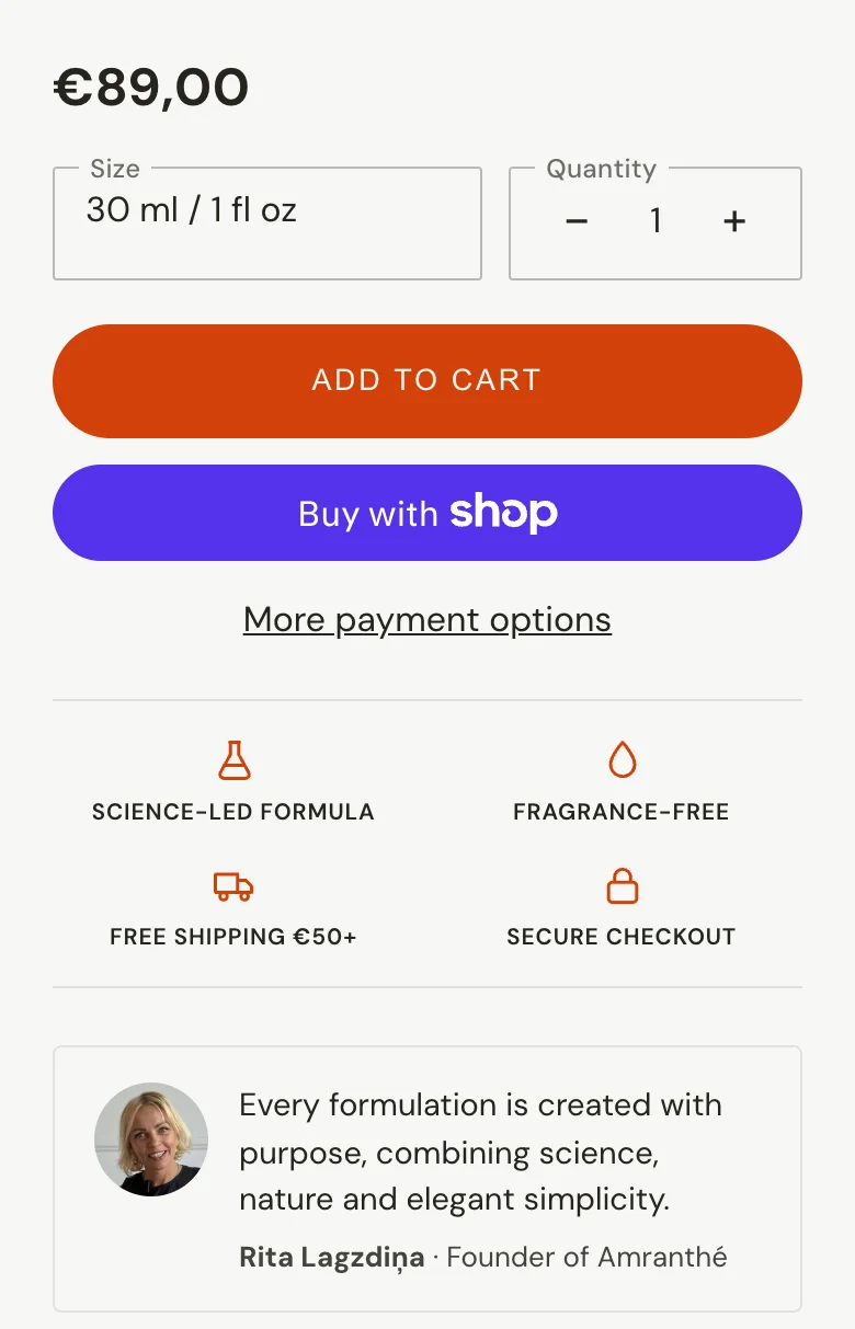
The founder's note with her name and photo right under the button, a rating by the product name, and four short facts: science-led formula, fragrance-free, free shipping from €50, secure checkout.

Why it works on the buyer

In a risky decision people look for a person, not a logo. A face and a name by the price turn an unknown brand into someone who answers for the product. Delivery and payment facts remove uncertainty, and uncertainty slows people down more than price does.

After
Buy box: price, size, add-to-cart button, four trust facts and the note from founder Rita Lagzdiņa with her photo
03

An honest explanation instead of an NAD+ promise

What we saw

The product is called “NAD+”, but there is no NAD+ in the formula, and the page didn't explain that.

What we changed

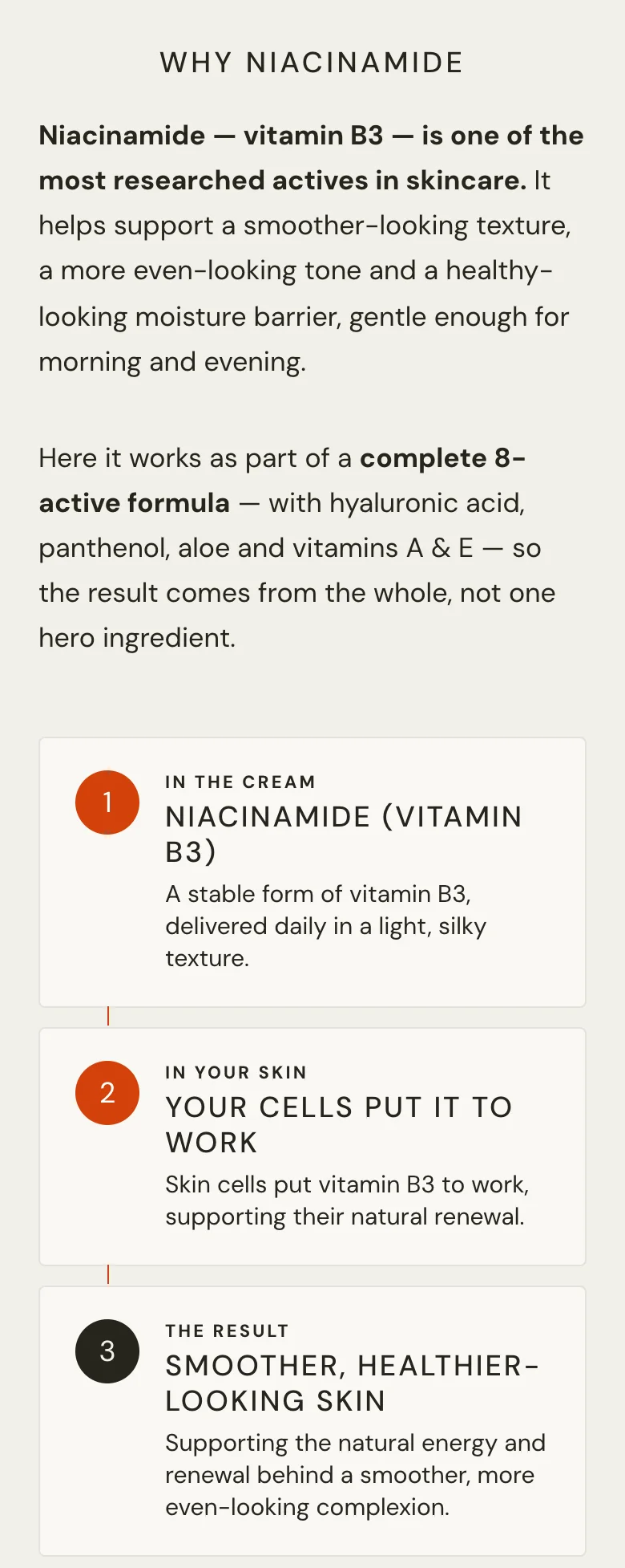
The page no longer implies the cream contains NAD+. A “Why Niacinamide” section explains the active the cream really contains, in three steps: in the cream, in your skin, the result.

Why it works on the buyer

An audience that clicks on a scientific promise checks the ingredients. If the promise and the formula don't match, they notice and leave. If the explanation matches what they find in the ingredient list, it becomes a reason to trust.

After
The “Why Niacinamide” section: an explanation of vitamin B3 and three steps from the cream to the result
04

The button on the first screen, and it stays visible

What we saw

On mobile the add-to-cart button was below the fold, with no sticky button.

What we changed

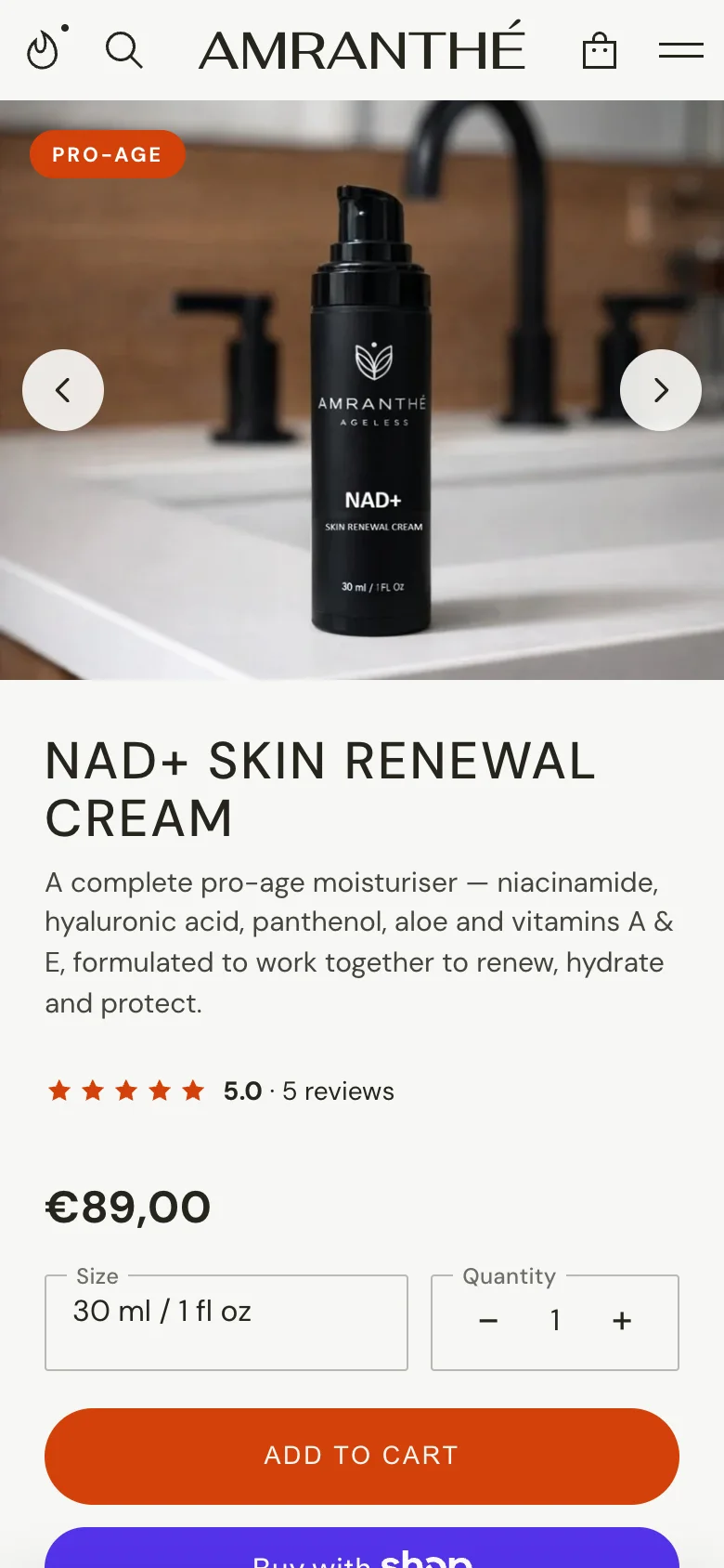
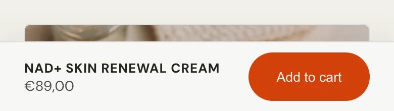
One line under the name saying what the cream is. Size next to the price. The add-to-cart button on the first screen, and a sticky button that stays visible as you scroll.

Why it works on the buyer

Every extra step between wanting and doing loses some people. When the button is always within reach, the decision can happen the moment it's ready, not when the button is found.

After · first screen on mobile
The product page's first screen on mobile: photo, name, description, rating, price and the add-to-cart button
After · while scrolling
The sticky bar at the bottom of the screen with the product name, price and an Add to cart button
05

What to expect after 1, 2 and 4 weeks

What we saw

The page didn't say when, or what, a buyer could expect from a €110 cream.

What we changed

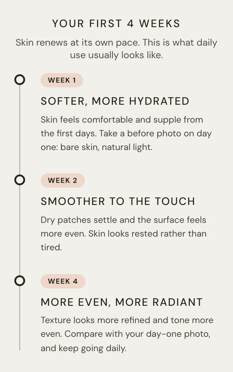
A results timeline: what usually happens in weeks one, two and four, and a suggestion to take a photo on day one.

Why it works on the buyer

An expensive skincare purchase is a promise about the future. When people can picture the first weeks, the doubt about whether it will work shrinks. A day-one photo gives them a way to see the result for themselves.

After
The “Your first 4 weeks” section: a timeline for weeks one, two and four
06

Fewer colours, fewer promises

What we saw

On the first draft, the client found too many colours and icons, and several blocks repeated what was already said.

What we changed

Headings in one colour and on one line, fewer icons, and the repeated blocks removed. We also took out a block that promised more than the brand can prove, and a 5-day delivery promise that can't be guaranteed to the US.

Why it works on the buyer

A premium buyer judges how the page looks, too. Too many colours make it feel like something is being pushed, and nothing registers. A promise you can't keep is worse than no promise.

RESULTS

What we'll measure

The ads haven't run on the new page yet, so there are no results yet. When they start, we'll compare against the same baseline with the same definitions.

MetricBeforeTarget
Session → cart1.68%5–7%
Cart → checkoutnot measurablemeasured from 30 carts
Purchases0 in week oneto be measured
  • The price is now €89, not €110. If add-to-cart rises, part of that will be the price, and we'll say so.
  • We'll publish results once the page has at least ~500 sessions from the same ads.

WHAT WE LEARNED

Trust is in the details

Most of this page's problems weren't design. They were small errors the brand no longer saw, because they had been there for a while. A buyer seeing the brand for the first time notices exactly those. That's why every audit starts with how the page looks to a stranger, not with what could be added.

Want the same for your store?

Start with a conversation. We'll tell you what delivers the biggest effect first.

30 min call