Case Study · DTC Baby Care · 2026

A brand reset, a Shopify rebuild,
and a conversion-ready foundation —
shipped in eight weeks.

How we rebuilt TheGeGe's storefront around a hero product, codified the brand voice, and engineered the conversion infrastructure for paid traffic. Live since May 5, 2026.

Client
TheGeGe
Category
DTC Baby Care
Platform
Shopify · Focal v8.11.4
Live
May 2026
Markets
EU + Baltics
A brand reset, a Shopify rebuild,and a conversion-ready foundation —shipped in eight weeks.

Not "make it better." A clear, commercial ask.

TheGeGe came to us with four explicit pillars for Phase 1 — each tied to a specific commercial outcome rather than aesthetic preference. The work was scoped around these from day one.

01

Hero-product-first

Reposition the catalog around a hero product. The category leader — formerly "Breast Relief Covers" — had to be rebranded as "Nipple Relief Covers" (the name search volume and ad copy actually reward) and become the entry point into the brand.

02

EU market launch

Build DE and IT homepage and PDP paths designed for those markets rather than translated-from-English filler. Baltics treated as a separate audience with their own funnel.

03

Brand voice reset

Replace the generic "eco / premium / medical / best / healing / pads" language with a documentary, lived-in voice the team called Filter Free Parenting. A specific never-list of forbidden words applied to every block of copy.

04

Conversion architecture

Cart, PDP, and homepage all had to move toward subscription and AOV — tiered free-shipping bar, in-cart upsells, and a PDP that surfaced technology and trust above the fold instead of below four screens of marketing copy.

A fifth implicit pillar threaded through everything: a complete customer acquisition funnel. Cold audiences land on advertorials, get warmed up, push through to an optimized PDP, then hit a multi-offer cart designed to increase AOV. Every part of the journey rebuilt to work together.

A deeply customized Focal install. Drifted out of sync.

The previous live theme was Focal with 150+ sections, two page builders layered on top of each other (PageFly + Shogun), and a sprawl of legacy template variants — product.context.germany.json, .latvia.json, .estonia.json, and two dozen others — that had drifted out of sync over years of patches.

Six symptoms we documented before touching a single file.

01 / Undifferentiated entry

Homepage hero led with a generic lifestyle banner. No single product was elevated; visitors had to navigate to find the category that actually drove revenue.

02 / PDP structure

PDPs were long, copy-heavy, and buried the technology and benefit story below testimonial walls. Variant pickers overflowed on mobile because the option name was duplicated into every swatch label ("0–3 months Size", "Vanilla Flavour"). No design structure carried across product templates.

03 / Cart drawer

Single-threshold free-shipping bar, no upsell module, no consolidated trust signals. Subtotal and savings were not visualized. A drawer cart and a standalone cart page existed simultaneously — confusing customers and losing conversions at the handoff.

04 / Mobile performance & CLS

Cumulative Layout Shift on key templates was elevated. Hero imagery lazy-loaded, marquee/ticker images had no declared width, and several above-the-fold blocks shifted on load.

05 / Voice & localization

Customer-facing copy was full of forbidden words from the new brand voice — "pads," "best," "medical," "healing," "eco," "premium" — and 18 locale files were inconsistent. The Estonian locale was missing core product-form keys entirely.

06 / Maintainability

Trust badges and delivery info were hard-coded per template. Editing a payment icon meant touching 20+ files.

/assets/case-studies/gege/02-old-homepage.png Before · Old homepage · 16:9
Optional — fall back to a representative pattern if no archive exists.
/assets/case-studies/gege/03-old-pdp.png Before · Old PDP mobile · 4:5
Optional — variant-overflow evidence on mobile.

Eight decisions that defined Phase 1.

The work below isn't a comprehensive changelog — it's the eight architectural decisions that mattered most. Each was made against an explicit hypothesis tied back to the four pillars. Each one is independently reversible. None of them were aesthetic preferences pretending to be strategy.

01

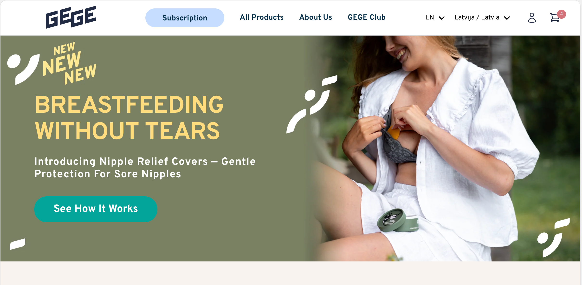
New hero PDP architecture

The brand's new front door.

Built templates/product.nipple-relief-covers.json as the brand's new front door. Eleven purpose-built sections in deliberate order: buy zone first; then why-choose, how-it-works, comparison table, expert quote, lifestyle banner, badge ticker, FAQ, reviews, you-may-also-like, product videos.

Section 1 carries the conversion. Section 2 onward does the convincing for the undecided. A new highlight block (text + optional icon, rendered between rating and price) gives marketing a controllable above-the-fold message — reusable on any PDP, not locked to one product.

/assets/case-studies/gege/04-new-pdp.png New PDP · Full-page scroll · 1:2 or 1:3
02

Three advertorial templates

One template per ad angle.

Built dedicated landing pages: Emotional angle, Problem angle, Trust angle. So paid traffic from different ad angles lands on a page that matches the angle, rather than the homepage.

All three live.

Each is independently testable. The agency can now isolate which angle wins per audience and per market without redeploying anything.

/assets/case-studies/gege/05-advertorials.png Three-up advertorial composition · 16:9
03

Multi-tier cart progress bar

€50 unlocks free shipping. €80 unlocks a special offer.

Replaced the single-threshold shipping bar with a two-tier bar. Customizer-driven thresholds and colors, fully translatable, feature-flagged so the single-tier fallback still works if disabled.

This directly targets AOV. Two-tier mechanics give the merchant an explicit lever to test thresholds without re-deploying — change a number in admin, watch the AOV move.

04

Cart drawer upsell + subtotal redesign

One drawer. No state drift.

Custom upsell widget inside the drawer, plus a rebuilt cart footer with savings line, trust badges, and payment icons consolidated in one place. The drawer re-renders on cart:refresh using Shopify's section rendering API so all of this stays accurate without JS state drift.

The old standalone cart-page redirect was removed entirely. One drawer, end to end. Less code, fewer bugs, faster checkout entry.

05

Global product card redesign

And a silent cart-error generator, fixed.

Rebuilt the global product card. Single-variant items get a true AJAX add-to-cart via Focal's product-form custom element; multi-variant items link to the PDP.

The old card had a hidden second form that bypassed variant selection — a silent cart-error generator that had been quietly costing conversions. Quick-buy drawer and popover paths kept intact. Fix is global: applies to every collection page, every grid, every recommendation widget across the site.

06

Global trust widgets via metafields

Edit once. Propagate everywhere.

Extracted the per-template delivery_info and trust_badge blocks into shop metafields and a Trust-badge metaobject. The merchant edits trust content once in admin and it propagates everywhere — instead of forking 20 templates.

This is the kind of work that doesn't show up in a homepage screenshot but compounds every month. Future content updates that used to take a full developer pass now take five minutes in the Shopify admin.

Optional — text can stand alone if no image is available.
07

Brand DNA + photoshoot pipeline

29 products, consistent for the first time.

Codified the brand into brand-profile.json — documentary, lived-in, Filter Free Parenting voice. Explicitly not white-linen-mom. Explicitly not clinical.

Then built an idempotent photoshoot pipeline (scripts/run_photoshoot.py) that produces five contextual styles plus clean transparent plus shadow-cutout for each product. 29 products fully reshot at roughly $0.55 and five minutes per product. The catalog image set is consistent across every product page for the first time in the brand's history.

/assets/case-studies/gege/10-photoshoot-grid.png Photoshoot grid · 4:3 or 1:1
/assets/case-studies/gege/10b-voice-before-after.png Brand voice · Before/after callout · 16:9
Optional — typographic comparison of forbidden words → new voice example.
08

CLS / performance fixes shipped post-launch

Diagnosed and corrected within a week of going live.

After publishing on May 5, RUM showed CLS P75 climbing from 0.02 toward 0.3 — a real-world regression we hadn't caught in pre-launch testing.

Diagnosed and shipped fixes within a week: eager-loaded the homepage hero, gave the badge ticker an explicit width (loading=eager, decoding=async — marquees can't lazy-load), set fetchpriority on the covers hero, and added an eager_load section setting to the lp-image-text-split block. Fixes live May 11–12.

Field-data recheck scheduled for May 18 — one full week after fixes shipped — to confirm trajectory back to the pre-launch baseline.

/assets/case-studies/gege/11-cls-chart.png CLS P75 chart or Lighthouse comparison · 16:9

Every choice tied to an explicit hypothesis.

Post-launch numbers are still settling — most directional metrics need at least 30 days inside the GA4 and RUM windows to be meaningful. But every decision above was made against a stated hypothesis. The list below documents what the rebuild was optimizing toward, so the eventual numbers can be measured against the right baseline.

01 / Clean acquisition funnel

Repositioned hero product as the lead magnet for cold audiences. Advertorials warm up. Optimized PDPs close. Cart and checkout redesigned to maximize the bottom of the funnel and lift AOV.

02 / Subscription conversion

Driven by a clearer purchase-option panel, removal of margin and border fights on the PDP, and elimination of forbidden-language copy that was undermining trust.

03 / AOV

Two levers: the €50 / €80 tiered shipping bar, and the in-drawer upsell module. The tiered mechanic specifically allows threshold testing without redeployment.

04 / PDP & homepage bounce

PDPs that surface buy zone, highlight block, and rating in the first viewport on mobile. Homepage that lands users on a hero product instead of a navigation puzzle.

05 / CLS / Core Web Vitals

CLS P75 back under the 0.1 threshold, with field-data recheck planned for May 18.

06 / Paid-traffic match-rate

Three advertorial templates per market mean the winning angle (emotional / problem / trust) can be isolated per audience instead of guessed.

07 / Localization conversion

DE and IT homepages and PDPs built market-first. Baltic-specific context templates retained. Goal is conversion parity with English, not literal translation.

08 / Maintainability

Reduced the number of files a merchant has to touch to change a trust badge or payment icon from approximately 20 to 1.

"A rebuild gives you the architecture you can test against. The CRO program is what actually compounds the lift."

Edvards R. Daniels · Founder, Red Digital
/assets/case-studies/gege/12-ambient.png Optional ambient image · 21:9 full-bleed

Most numbers are still inside the window.

This case study is being published eight business days after Phase 1 went live. Real CRO honesty means waiting for the 30-day window to close before claiming conversion deltas. Here's what we can responsibly share today — and what we'll add in the update.

01 / Stability

Shipped seven post-launch fixes on May 11–12 (variant-box overflow across all multi-variant products, ATC button localization, collection-banner H1 sizing with 640px description max-width, testimonial avatar support, product-card variant-selection bug). Production was stable enough to keep the new theme live throughout.

02 / CLS P75

Hero image and marquee-ticker corrections shipped the same week the spike appeared. Field-data recheck scheduled for May 18 — expected trajectory is P75 back from 0.3 toward the 0.02 baseline we held before launch.

03 / Catalog consistency

29 products now ship with consistent, on-brand imagery across five lifestyle styles plus clean cutout plus shadow cutout — replacing a patchwork of merchant-supplied photography. The pipeline is reusable for every future SKU.

04 / Voice compliance

Locale and section sweep complete. Zero instances of the forbidden words (pads / best / medical / healing / eco / premium) in customer-facing copy, outside the legacy Premium and Eco product line names the brand chose to keep.

05 / Funnel readiness

Three live advertorial templates plus the rebuilt hero PDP are instrumented and ready for paid traffic. The A/B framework is in place for Phase 2.

Update planned for early June 2026, once the first 30-day post-launch window closes. Full conversion, AOV, and bounce deltas will be added here.

The foundation is built. Now we run the program.

Phase 1 gave TheGeGe the architecture: a hero-product-first homepage, instrumented advertorials, a cart designed for AOV, a PDP structured for conversion, and a clean codebase that doesn't fight ongoing change. That's the foundation. It's not the result.

The result comes from Phase 2 — a systematic conversion optimization program running against real traffic and real data. Monthly hypotheses prioritized against the highest-impact funnel stages. Tests built and shipped within the same retainer that defines them. Winning variants locked into production. Losing variants analyzed for what they teach about the next test.

The infrastructure is ready. The instrumentation is in place. The next chapter is the program.

Work With Us

Want a rebuild that's built to be tested?

We build supplement and consumable DTC stores with conversion optimization baked into the architecture — not bolted on after launch. Book a discovery call to talk through what your store needs.